CDC Data Exercise

Introduction

This analysis uses publicly available data from the Centers for Disease Control and Prevention (CDC) to explore the prevalence of post-COVID conditions (long COVID) among adults in the United States.

library(tidyverse)
── Attaching core tidyverse packages ──────────────────────── tidyverse 2.0.0 ──
✔ dplyr     1.2.0     ✔ readr     2.1.6
✔ forcats   1.0.1     ✔ stringr   1.6.0
✔ ggplot2   4.0.1     ✔ tibble    3.3.1
✔ lubridate 1.9.5     ✔ tidyr     1.3.2
✔ purrr     1.2.1     
── Conflicts ────────────────────────────────────────── tidyverse_conflicts() ──
✖ dplyr::filter() masks stats::filter()
✖ dplyr::lag()    masks stats::lag()
ℹ Use the conflicted package (<http://conflicted.r-lib.org/>) to force all conflicts to become errors
library(janitor)

Attaching package: 'janitor'

The following objects are masked from 'package:stats':

    chisq.test, fisher.test
library(here)
here() starts at C:/Users/PC/Documents/GitHub/SaraaAljawad-portfolio
# Read CDC data
raw <- read_csv(here("cdcdata-exercise", "Post-COVID_Conditions_20260206.csv"))
Rows: 18639 Columns: 16
── Column specification ────────────────────────────────────────────────────────
Delimiter: ","
chr (9): Indicator, Group, State, Subgroup, Time Period Label, Time Period S...
dbl (7): Phase, Time Period, Value, LowCI, HighCI, Quartile number, Suppress...

ℹ Use `spec()` to retrieve the full column specification for this data.
ℹ Specify the column types or set `show_col_types = FALSE` to quiet this message.
# Inspect structure
glimpse(raw)
Rows: 18,639
Columns: 16
$ Indicator                <chr> "Ever experienced long COVID, as a percentage…
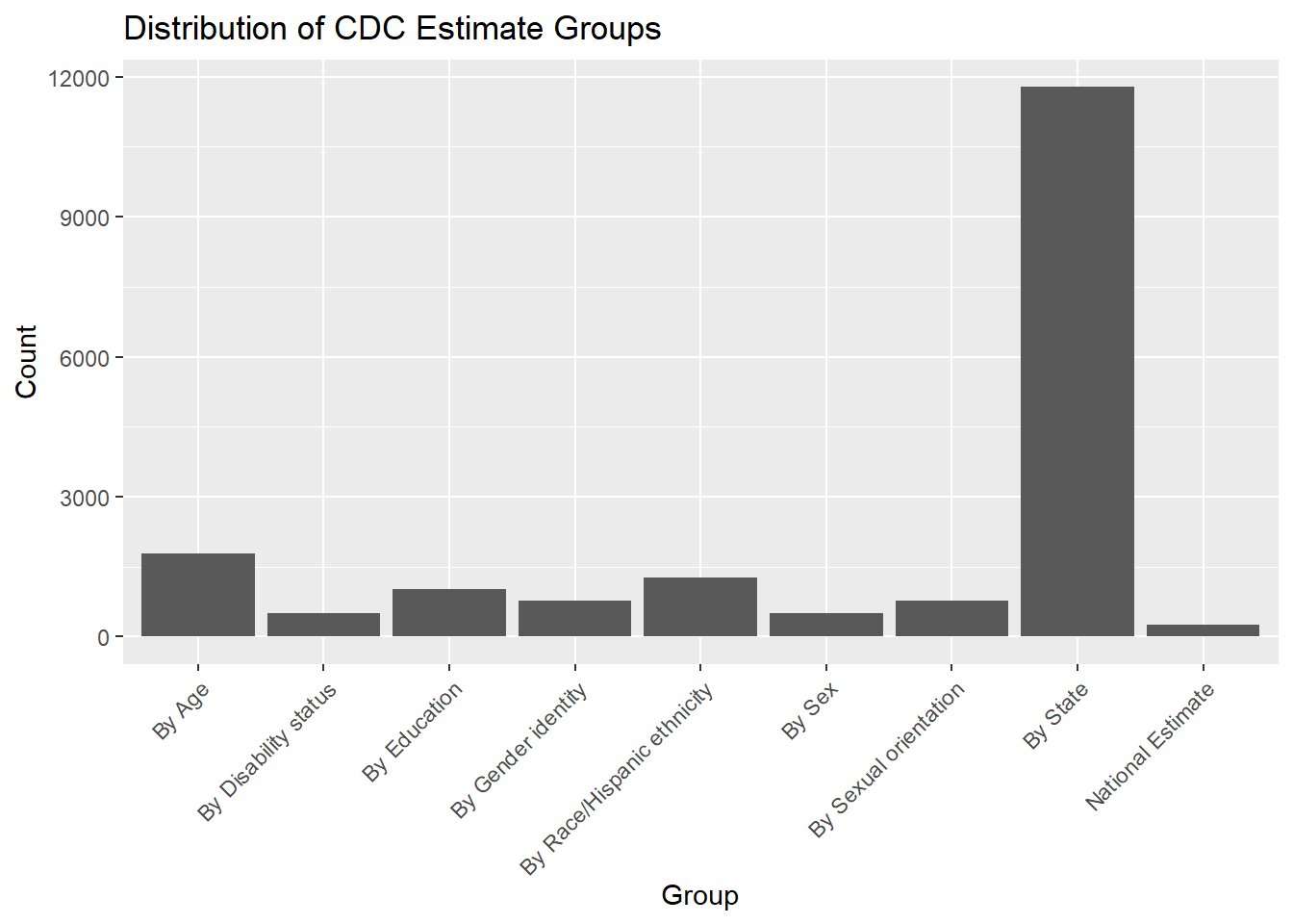
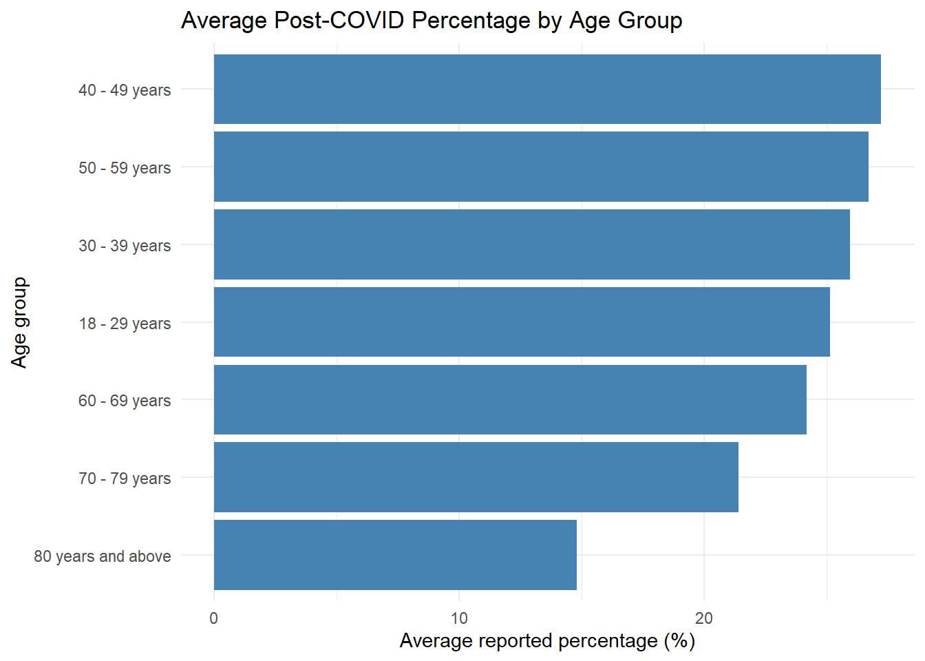
$ Group                    <chr> "National Estimate", "By Age", "By Age", "By …
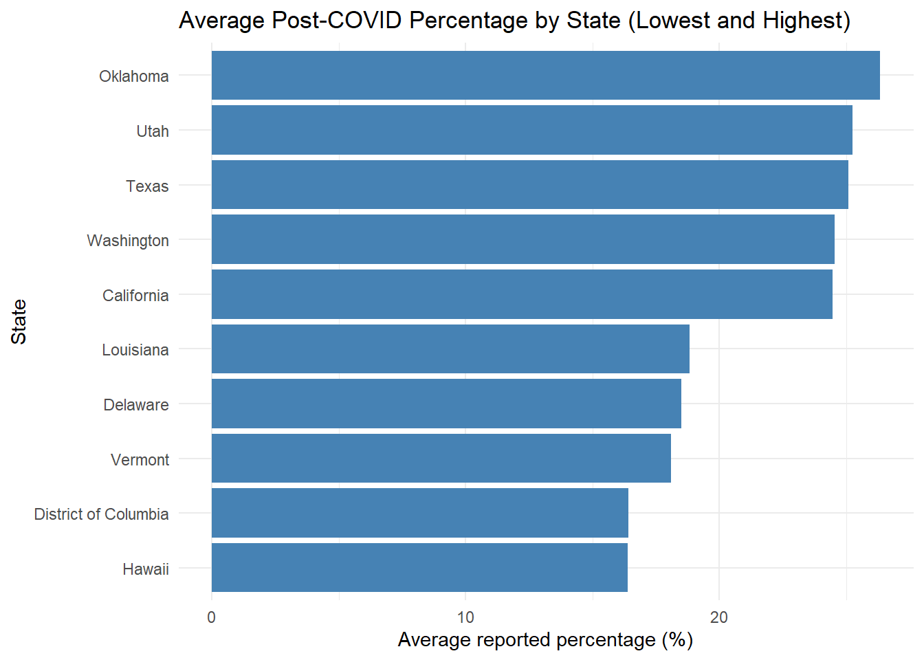
$ State                    <chr> "United States", "United States", "United Sta…
$ Subgroup                 <chr> "United States", "18 - 29 years", "30 - 39 ye…
$ Phase                    <dbl> 3.5, 3.5, 3.5, 3.5, 3.5, 3.5, 3.5, 3.5, 3.5, …
$ `Time Period`            <dbl> 46, 46, 46, 46, 46, 46, 46, 46, 46, 46, 46, 4…
$ `Time Period Label`      <chr> "Jun 1 - Jun 13, 2022", "Jun 1 - Jun 13, 2022…
$ `Time Period Start Date` <chr> "06/01/2022", "06/01/2022", "06/01/2022", "06…
$ `Time Period End Date`   <chr> "06/13/2022", "06/13/2022", "06/13/2022", "06…
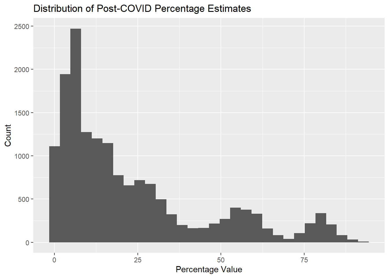
$ Value                    <dbl> 14.0, 17.8, 15.2, 16.9, 15.3, 10.9, 7.1, 4.2,…
$ LowCI                    <dbl> 13.5, 15.9, 14.1, 15.7, 14.1, 9.8, 5.9, 3.4, …
$ HighCI                   <dbl> 14.5, 19.8, 16.2, 18.3, 16.7, 12.0, 8.5, 5.3,…
$ `Confidence Interval`    <chr> "13.5 - 14.5", "15.9 - 19.8", "14.1 - 16.2", …
$ `Quartile range`         <chr> NA, NA, NA, NA, NA, NA, NA, NA, NA, NA, NA, N…
$ `Quartile number`        <dbl> NA, NA, NA, NA, NA, NA, NA, NA, NA, NA, NA, N…
$ `Suppression Flag`       <dbl> NA, NA, NA, NA, NA, NA, NA, NA, NA, NA, NA, N…

Data Description

The dataset contains survey-based estimates from the CDC household Survey that describe the prevalence of post-COVID conditions (long COVID) among adults aged 18 and older in the United States.Each row in the dataset represents a population-level estimate for a specific group and time period. The main variables used in this analysis include the type of long COVID indicator being measured, population group and subgroup categories, the time period of data collection, and the estimated percentage value.

Data Cleaning

# Clean column names
data_clean <- raw %>%
  clean_names()

# Select relevant variables
cdc_data <- data_clean %>%
  select(
    indicator,
    group,
    subgroup,
    time_period_label,
    value
  )

# Inspect cleaned dataset
glimpse(cdc_data)
Rows: 18,639
Columns: 5
$ indicator         <chr> "Ever experienced long COVID, as a percentage of all…
$ group             <chr> "National Estimate", "By Age", "By Age", "By Age", "…
$ subgroup          <chr> "United States", "18 - 29 years", "30 - 39 years", "…
$ time_period_label <chr> "Jun 1 - Jun 13, 2022", "Jun 1 - Jun 13, 2022", "Jun…
$ value             <dbl> 14.0, 17.8, 15.2, 16.9, 15.3, 10.9, 7.1, 4.2, 10.5, …

Exploratory Data Analysis

Exploring the distribution and overall structure of the data

# Summary statistics for the continuous variable
cdc_data %>%
  summarize(
    mean_value = mean(value, na.rm = TRUE),
    sd_value   = sd(value, na.rm = TRUE),
    min_value  = min(value, na.rm = TRUE),
    max_value  = max(value, na.rm = TRUE)
  )
# A tibble: 1 × 4
  mean_value sd_value min_value max_value
       <dbl>    <dbl>     <dbl>     <dbl>
1       23.0     22.5         0      92.8
# Frequency table for indicator
indicator_freq <- cdc_data %>%
  count(indicator) %>%
  mutate(percent = n / sum(n) * 100)

Visualization of the data

# Histogram of percentage estimates
ggplot(cdc_data, aes(x = value)) +
  geom_histogram(bins = 30) +
  labs(
    title = "Distribution of Post-COVID Percentage Estimates",
    x = "Percentage Value",
    y = "Count"
  )
Warning: Removed 2453 rows containing non-finite outside the scale range
(`stat_bin()`).

The histogram shows the distribution of estimated percentages of adults experiencing post-COVID conditions across different population groups and time periods. Most estimates are concentrated below 30%, indicating that reported prevalence of long COVID is generally low to moderate for most groups. Higher percentage values occur less frequently and represent specific subgroups with elevated reported prevalence.

# Percentage distribution of groups
cdc_data %>%
  count(group) %>%
  mutate(percent = round(n / sum(n) * 100, 1))
# A tibble: 9 × 3
  group                          n percent
  <chr>                      <int>   <dbl>
1 By Age                      1778     9.5
2 By Disability status         508     2.7
3 By Education                1016     5.5
4 By Gender identity           762     4.1
5 By Race/Hispanic ethnicity  1270     6.8
6 By Sex                       508     2.7
7 By Sexual orientation        762     4.1
8 By State                   11781    63.2
9 National Estimate            254     1.4
# Bar plot for categorical variable
ggplot(cdc_data, aes(x = group)) +
  geom_bar() +
  labs(
    title = "Distribution of CDC Estimate Groups",
    x = "Group",
    y = "Count"
  ) +
  theme(axis.text.x = element_text(angle = 45, hjust = 1))

It has been seen that most observations in the dataset come from state-level estimates, which account for over half of all records. Other estimates are distributed across demographic groupings such as age, race/ethnicity, education, and sex. National-level estimates represent a smaller proportion of the data, reflecting the CDC’s emphasis on reporting subgroup-specific prevalence estimates.

Explore and visualize Post-COVID prevalence

(a) by age group

Age in this dataset is reported as categorical age groups rather than as individual ages. The CDC defines these groups as 18–29, 30–49, 50–64, and 65 years and older

age_data <- cdc_data %>%
  filter(group == "By Age")
age_summary <- age_data %>%
  group_by(subgroup) %>%
  summarize(
    mean_value = mean(value, na.rm = TRUE)
  )
age_summary
# A tibble: 7 × 2
  subgroup           mean_value
  <chr>                   <dbl>
1 18 - 29 years            25.2
2 30 - 39 years            26.0
3 40 - 49 years            27.2
4 50 - 59 years            26.7
5 60 - 69 years            24.2
6 70 - 79 years            21.4
7 80 years and above       14.8
ggplot(age_summary,
       aes(x = reorder(subgroup, mean_value),
           y = mean_value)) +
  geom_col(fill = "steelblue") +
  coord_flip() +
  labs(
    title = "Average Post-COVID Percentage by Age Group",
    x = "Age group",
    y = "Average reported percentage (%)"
  ) +
  theme_minimal()

This summarizes CDC-reported post-COVID condition percentages across age groups. The visualization highlights which age groups tend to report higher or lower post-COVID prevalence.

(b) by state

state_data <- cdc_data %>%
  filter(group == "By State")
state_summary <- state_data %>%
  group_by(subgroup) %>%   # subgroup = state name
  summarize(
    mean_value = mean(value, na.rm = TRUE)
  )

state_summary
# A tibble: 51 × 2
   subgroup             mean_value
   <chr>                     <dbl>
 1 Alabama                    23.2
 2 Alaska                     20.8
 3 Arizona                    24.0
 4 Arkansas                   22.0
 5 California                 24.5
 6 Colorado                   24.4
 7 Connecticut                22.0
 8 Delaware                   18.5
 9 District of Columbia       16.4
10 Florida                    24.1
# ℹ 41 more rows
state_top_bottom <- state_summary %>%
  arrange(mean_value) %>%
  slice(c(1:5, (n()-4):n()))

state_top_bottom
# A tibble: 10 × 2
   subgroup             mean_value
   <chr>                     <dbl>
 1 Hawaii                     16.4
 2 District of Columbia       16.4
 3 Vermont                    18.1
 4 Delaware                   18.5
 5 Louisiana                  18.8
 6 California                 24.5
 7 Washington                 24.6
 8 Texas                      25.1
 9 Utah                       25.3
10 Oklahoma                   26.3
ggplot(state_top_bottom,
       aes(x = reorder(subgroup, mean_value),
           y = mean_value)) +
  geom_col(fill = "steelblue") +
  coord_flip() +
  labs(
    title = "Average Post-COVID Percentage by State (Lowest and Highest)",
    x = "State",
    y = "Average reported percentage (%)"
  ) +
  theme_minimal()

State-level post-COVID percentages were summarized in this plot by averaging CDC-reported estimates across time periods. The visualization highlights relative differences in reported post-COVID prevalence among states.

(c) by sex

sex_data <- cdc_data %>%
  filter(group == "By Sex")

sex_summary <- sex_data %>%
  group_by(subgroup) %>%
  summarize(
    mean_value = mean(value, na.rm = TRUE)
  )

sex_summary
# A tibble: 2 × 2
  subgroup mean_value
  <chr>         <dbl>
1 Female         27.1
2 Male           23.4
ggplot(sex_summary,
       aes(x = reorder(subgroup, mean_value),
           y = mean_value,
           fill = subgroup)) +
  geom_col() +
  coord_flip() +
  labs(
    title = "Average Reported Post-COVID Percentage by Sex",
    x = "Sex",
    y = "Average reported percentage (%)"
  ) +
  theme_minimal() +
  guides(fill = "none")

This figure compares average CDC-reported post-COVID condition percentages by sex. Females report a higher average post-COVID percentage than males.

Notes for Synthetic Data Generation

To create synthetic data with a similar structure, the key variable to mimic is value which represents the percentage of adults reporting post-COVID conditions. These percentage values ranges from 0 to about 93 with most values below 30. The synthetic data should also include the same categorical columns (such as group, indicator, and subgroup) and use similar proportions (for example, many rows should be state-level estimates, and fewer rows should be national or demographic estimates). In addition, the synthetic data should include survey time periods so that the overall structure matches the original dataset.

This section contributed by Joe Dainis

## Load Required Packages
library(here)
library(dplyr)
library(ggplot2)
library(skimr)
library(gtsummary)

## Set Seed for Reproducibility
set.seed(456)

## Define the number of COVID-19 survey responders
n_COVID <- 18638

## Create an empty dataframe with the 5 variables from COVID-19 survey dataset

syn_dat <- data.frame(
  Indicator = character(n_COVID),
  Group = character(n_COVID),
  TimePeriodLabel = character(n_COVID),
  Value = numeric(n_COVID)
)

## Variable 1: Indicator

syn_dat$Indicator <- sample(c("Any activity limitations from long COVID, as a percentage of adults who currently have long COVID", "Any activity limitations from long COVID, as a percentage of all adults", "Currently experiencing long COVID, as a percentage of adults who ever had COVID", "Currently experiencing long COVID, as a percentage of all adults", "Ever experienced long COVID, as a percentage of adults who ever had COVID", "Ever experienced long COVID, as a percentage of all adults", "Ever had COVID", "Significant activity limitations from long COVID, as a percentage of adults who currently have long COVID", "Significant activity limitations from long COVID, as a percentage of all adults"),
                          n_COVID, replace = TRUE, prob = as.numeric(indicator_freq$percent)/100)

## Variable 2: Group
syn_dat$Group <- sample(c("By Age", "By Disability Status", "By Education", "By Gender identity", "By Race/Hispanic ethnicity", "By Sex", "By Sexual orientation", "By State", "National Estimate"), 
                         n_COVID, replace = TRUE, 
                         prob = as.numeric(table(data_clean$group)/100))


## Variable 3: Time Period Label
target_column <- "time_period_label"

time_probs <- prop.table(table(data_clean[[target_column]], useNA = "no"))

syn_dat$TimePeriodLabel <- sample(
  x = as.character(names(time_probs)), # Ensure this isn't NULL/Empty
  size = n_COVID,
  replace = TRUE,
  prob = as.numeric(time_probs)
)

## Variable 4: Value with Dependencies 

library(dplyr)
library(purrr)

# Split the original data into a list of dataframes based on 'group'
## This creates a 'library' where each drawer only has one group's data
source_list <- split(data_clean, data_clean$group)

# Use group_split on syn_dat to process each group separately
syn_dat <- syn_dat %>%
  group_split(Group) %>%
  map_dfr(function(sub_df) {
    # Identify which group we are currently processing
    current_group <- unique(sub_df$Group)
    
    # Check if this group actually exists in our source data
    if (current_group %in% names(source_list)) {
      pool <- source_list[[current_group]]
      
      # Sample indices equal to the number of rows needed for this group
      sampled_rows <- sample(seq_len(nrow(pool)), size = nrow(sub_df), replace = TRUE)
      
      # Fill the Subgroup and Value columns from the matched pool
      sub_df$Subgroup_Age_Sex_State <- pool$subgroup[sampled_rows]
      sub_df$Value <- pool$value[sampled_rows]
    }
    
    return(sub_df)
  })

#It took me a LONG while to figure this out due to the complexity of the data. I used Gemini AI to help me figure this out. Too many dependencies with all of them being in one column... ... ... Data structure matters a ton! I ended up needing to split the data first, as the subgroup column had SO MANY different categories (sex, age range, sexuality, state, etc etc.) Then, to add in the dependencies based on how the groupings were split, which allowed for the synthetic data to show the necessary depencies for the COVID values on these variables. All of the other variables were straight forward.

view(syn_dat)

#Joe Summaries of Variables and Data

#Visualization of Percentage Values from synthetic data by histogram
ggplot(syn_dat, aes(x = Value)) +
  geom_histogram(bins = 30) +
  labs(
    title = "Distribution of Post-COVID Synthetic Percentage Estimates",
    x = "Percentage Values",
    y = "Count"
  )
Warning: Removed 2290 rows containing non-finite outside the scale range
(`stat_bin()`).

#Look at distribution of synthetic data from groups
##Percentage distribution of groups
syn_dat %>%
  count(Group) %>%
  mutate(percent = round(n / sum(n) * 100, 1))
# A tibble: 9 × 3
  Group                          n percent
  <chr>                      <int>   <dbl>
1 By Age                      1691     9.1
2 By Disability Status         534     2.9
3 By Education                1051     5.6
4 By Gender identity           766     4.1
5 By Race/Hispanic ethnicity  1289     6.9
6 By Sex                       534     2.9
7 By Sexual orientation        749     4  
8 By State                   11758    63.1
9 National Estimate            266     1.4
##Bar plot for group data
ggplot(syn_dat, aes(x = Group)) +
  geom_bar() +
  labs (
    title = "Distribution of synthetic CDC estimated groups",
    x = "Group",
    y = "Count"
  ) +
    theme(axis.text.x = element_text(angle = 45, hjust = 1))

#Looking at the synthetic age data
##Group the synthetic data by age
Joe_age_data <- syn_dat %>%
  filter(Group == "By Age")

##Summarize the mean values for age ranges
Joe_age_summary <- Joe_age_data %>%
  group_by(Subgroup_Age_Sex_State) %>%
  summarize(
    mean_value_age = mean(Value, na.rm = TRUE)
  )
Joe_age_summary
# A tibble: 7 × 2
  Subgroup_Age_Sex_State mean_value_age
  <chr>                           <dbl>
1 18 - 29 years                    23.8
2 30 - 39 years                    26.5
3 40 - 49 years                    30.2
4 50 - 59 years                    25.1
5 60 - 69 years                    25.3
6 70 - 79 years                    24.2
7 80 years and above               15.5
##Create a plot of age range and reported COVID prevalence
ggplot(Joe_age_summary,
       aes(x = reorder(Subgroup_Age_Sex_State, mean_value_age),
           y = mean_value_age)) +
  geom_col(fill = "steelblue") +
  coord_flip() +
  labs(
    title = "Average Post-COVID Percentage by Age Group",
    x = "Age group",
    y = "Average reported percentage (%)"
  ) +
  theme_minimal()

#Looking at the synthetic state data
##Group the synthetic data by state
Joe_state_data <- syn_dat %>%
  filter(Group == "By State")

##Summarize the mean values for age ranges
Joe_state_summary <- Joe_state_data %>%
  group_by(Subgroup_Age_Sex_State) %>%
  summarize(
    mean_value_state = mean(Value, na.rm = TRUE)
  )
Joe_state_summary
# A tibble: 51 × 2
   Subgroup_Age_Sex_State mean_value_state
   <chr>                             <dbl>
 1 Alabama                            23.3
 2 Alaska                             23.0
 3 Arizona                            24.2
 4 Arkansas                           20.6
 5 California                         25.4
 6 Colorado                           23.7
 7 Connecticut                        23.9
 8 Delaware                           17.6
 9 District of Columbia               18.8
10 Florida                            23.2
# ℹ 41 more rows
##Create a plot of state and reported COVID prevalence
state_top_bottom_Joe <- Joe_state_summary %>%
  arrange(mean_value_state) %>%
  slice(c(1:5, (n()-4):n()))

state_top_bottom_Joe
# A tibble: 10 × 2
   Subgroup_Age_Sex_State mean_value_state
   <chr>                             <dbl>
 1 Vermont                            16.4
 2 New York                           17.4
 3 Delaware                           17.6
 4 New Jersey                         18.0
 5 Rhode Island                       18.6
 6 Massachusetts                      24.2
 7 Arizona                            24.2
 8 California                         25.4
 9 Utah                               27.9
10 Oklahoma                           28.6
ggplot(state_top_bottom_Joe,
       aes(x = reorder(Subgroup_Age_Sex_State, mean_value_state),
           y = mean_value_state)) +
  geom_col(fill = "steelblue") +
  coord_flip() +
  labs(
    title = "Average Post-COVID Percentage by State",
    x = "State",
    y = "Average reported percentage (%)"
  ) +
  theme_minimal()

#Looking at the synthetic age data
##Group the synthetic data by sex
Joe_sex_data <- syn_dat %>%
  filter(Group == "By Sex")

##Summarize the mean values for age ranges
Joe_sex_summary <- Joe_sex_data %>%
  group_by(Subgroup_Age_Sex_State) %>%
  summarize(
    mean_value_sex = mean(Value, na.rm = TRUE)
  )
Joe_sex_summary
# A tibble: 2 × 2
  Subgroup_Age_Sex_State mean_value_sex
  <chr>                           <dbl>
1 Female                           28.2
2 Male                             22.4
##Create a plot of age range and reported COVID prevalence
ggplot(Joe_sex_summary,
       aes(x = reorder(Subgroup_Age_Sex_State, mean_value_sex),
           y = mean_value_sex,
           fill = Subgroup_Age_Sex_State)) +
  geom_col() +
  coord_flip() +
  scale_fill_manual(values = c("Female" = "red", "Male" = "blue")) +
  labs(
    title = "Average Post-COVID Percentage by Sex",
    x = "Sex",
    y = "Average reported percentage (%)"
  ) +
  theme_minimal() +
  guides(fill = "none")

#It looks like my synthetic data is close to the original!